A Scotland based artist who grew up enveloped in the nature of the Italian alps, Nataša Ilinčić’s watercolor creations spark joy, whimsy, and a sense of inner calm in viewers. Ilincic has made tarot decks, art books, and has illustrated countless covers and book pages, Apex Magazine being the newest addition to that list.
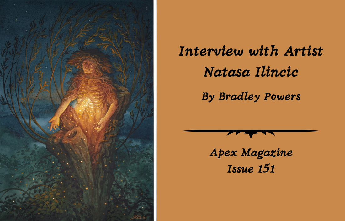
BRADLEY POWERS: On Instagram you posted what looks like preliminary studies for this month’s cover piece “Hedge Grandmother.” You captioned that you’ve wanted to make this personal piece for years. Can you explain the significance of this piece to you? Why did it take years to come to fruition?
NATAŠA ILINČIĆ: When I was little, I was always fascinated by the far end of the garden. Where the lights of our house couldn’t reach, where the stars shone the brightest and fireflies made their home. It was a liminal, mysterious place. Never entirely of this world. The “Hedge Grandmother” represents that and the invisible forces that are drawn to it. Most of my paintings take a while to come to life—they exist in my mind until the right time comes. Busy schedules don’t make it easy. When I created this piece, I penned down a few lines to accompany it. They read: In her warm embrace / Lost travellers rest / Their weary eyes & tired bones. The original watercolour piece is currently listed on my website, natasailincic.com.
BP: You have illustrated an absolutely gorgeous set of tarot cards, called Tarot of the Witches Garden. Illustrating tarot cards is a huge undertaking because it requires seventy-eight unique illustrations, plus the backs of cards, packaging, and I'm sure countless other details that you wouldn't know until you were in the midst of it. What did this project mean to you and what did you learn throughout the process?
NI: Yes, it was a huge undertaking. A marathon that required a lot of stamina and careful pacing. Like my A Compendium of Witches book and Oracle was a great opportunity to work on something large that tested my ability to create something harmonious and cohesive.
BP: Give us a short and sweet explanation of your thesis on traditional female Balkan tattooing and why it sparked your interest.
NI: My thesis examines traditional female tattooing in the Balkan Peninsula, specifically among the Bosnian Croat population. In this region it’s called bocanje or sicanje. Its symbols are clearly connected to a deep pagan past that revolved around the worship of the forces of nature. This tradition was already present among the indigenous Illyrian population, before Romanisation, and it survived the Slavic migrations and Christianization, retaining its form but adapting to a new context. It was used as a sign of ethnic-religious distinction during the Ottoman occupation or sometimes simply as decoration. During my research I travelled to Bosnia to interview the last bearers of these symbols and preserve their stories. It was important for me from a spiritual point of view, as a pagan, as well as from a personal one, as my roots are Croatian. I’m in the process of translating the thesis in English. Once it’s published, folks will be notified through my newsletter and social media pages.
BP: Your medium of choice appears to be watercolor. Explain the painting process and the planning that goes into creating such detailed works of art.
NI: I’m not sure a short answer can do this justice! Each piece starts with a rough sketch that is then polished and transferred onto watercolour hot pressed cotton paper. The painting comes to life through an application of several layers, usually starting with light values and gradually building up darker tones. I often add some touches of gouache at the end for the opaque details. My paints of choice are Winsor & Newton, Schmincke, and Daniel Smith. I’ve written several lengthy tutorials that are now featured in my Patreon page (patreon.com/natasailincic).
BP: Very often there are figures as the subjects of your pieces. Do you have repeated characters you like to feature? Where do the inspirations for these people come from?
NI: Not really, but people have often remarked that there is a certain resemblance among the figures I paint. I think that might be the painter seeping into the painting. The figures I paint are often inspired by mythology, folklore, and history. I’m especially fascinated by powerful female figures that defy social constructs, like my recent works inspired by Medusa, Baba Yaga, and Cailleach.
BP: Your piece, “Three of Cups,” in the Tarot of the Witch’s Garden deck reminds me of The Three Graces, a trio consisting of the three daughters of Zeus which is a symbol present throughout centuries of art history. Was this a purposeful use of symbolism, and if so, can you explain the connection between the Three Graces and the Three of Cups in tarot?

NI: I believe that historically there is a certain parallelism between the Three of Cups and the figures of the Graces, yes! As a card, it represents celebration, joy, sisterhood, and unity—something that the Graces clearly embody. Much of tarot symbology is inspired by the Classical European past, as well as Medieval lore which occurred later on.
BP: Natasa, the classical influences woven into your work create a great sense of depth and intrigue. Thank you so much for diving into your process and the thoughts behind these gorgeous pieces.
To find more of Natasa’s work check out her website, Facebook, and Instagram.