APEX MAGAZINE: Mark Greyland is a talented creator who transforms his art into a sensory and visual experience, and Apex Magazine is lucky to feature him as our November cover artist.
Hello Mark! We’re thrilled to have your art featuring the cover of our magazine. Can you tell us a little bit about yourself as an artist? How did you discover your love of making art?
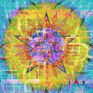
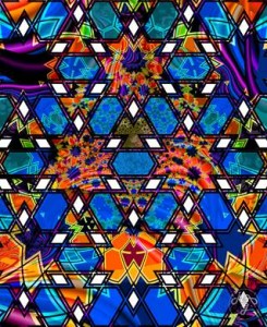
MARK GREYLAND: Much of the art I do comes from my synesthesia, a lifelong condition of sensory blending. I have always been drawn to the powerful images that are found in nature but as time went on I found that what drew me was often either invisible or irrelevant to the other artists, much less the people looking at the early pictures I was drawing. I think I was fourteen when I decided I needed to start taking visual notes of what I was seeing. I started focusing on the more geometric, as opposed to organic images in my twenties, after I had gotten some training in computer art programs. This is where I adopted the term ‘geofractal’ to describe my images.
AM: Drifting Girl II is the second in a series of ‘Drifting Girl’ art pieces. They are very evocative! Can you tell us your insights behind the creation of Drifting Girl II? Are there connections between all of the Drifting Girl pieces?
MG: Yes, the Drifting Girl series is, like all of my work, talking about itself. I have been dealing with a certain abstraction in the way I viewed the human body. I decided the best way to approach the problem was to make an abstraction of a female torso, then stare at it until the images sorted themselves out. This led to many experiments with fractals and other images to try and get the sense of overwhelming detail that I get when I look at a body. I have a new series as yet untitled where I am using a living model with consent and using human images in my pieces, so Drifting Girl led me directly to that.
AM: How do you choose the colors and patterns that go into making each of your art pieces? What guides your technique and style?
MG: That is perhaps one of the most difficult questions I have ever been asked about my work. I can’t explain about the patterns except I spent years designing personal library of vector images, interlace and overlapping circles, that sort of thing, but during the color and pattern stage it is me drifting in memory until I remember something and I find the closest images I have, incorporate them and get to work. I usually begin with a strong vector image and open it in Photoshop at the target resolution for the finished piece. From there I start transforming the image, make duplicates and apply effects and bring in other images to blend and transform what I am working on until I find the something I am looking for. The strong colors come from my inner world which is saturated with sound and image enough to keep the wolves awake! (Howls in the background.)
AM: I noticed in your art gallery that some of the pieces feature the distinct shapes of cats! Specifically a cat named Pixel? Can you tell us more about how Pixel inspires you to integrate cats into your art?
MG: Pixel the space kitten was a vector image I built in collaboration with my autistic son Forest. He was about eight years old and was telling me story after story about a kitten in his world with yellow fur (Forest is blond) glasses and a white T–shirt. The image caught me so much I started seeing this image like a children’s flash card of a cat only suffused with color, so I started trying to build the image. You will note I included Pixel’s image for the artist’s self–portrait. Pixel really is a part of me and has crept into a number of works I thought were going to be more serious. Pixel has also shown up in greeting cards and has appeared with my blessing on the cheezburger.com (sic) website with added captions.
AM: What do you enjoy about using fractals to make art? Is there anything about using fractals that can artistically frustrate you?
MG: Using fractals to me is looking through an infinite non–repeatable image library of natural and semi–natural patterns, if that is the right word. I used to be the kid who would stare at cracks in concrete and blobs of paint on the wall and feel inspired. My biggest frustration with fractals is that they never really get the depth I am looking for or they get turned funny and I lose the inspiration I was looking for at the touch of a button. When I get a good one, where I can lose myself in the detail I will save it and try it with several of my other patterns looking for that touch of memory.
AM: What sorts of images and messages do you want to evoke in your art? What are your thoughts on sharing your art, and the feedback you receive from other people who respond positively to your vivid art pieces?
MG: Don’t take this the wrong way but I am always working first for myself. It has to be that way as I am exploring the intangible, subconscious world. I derived inspiration from many diverse sources like M.C.Escher, Yves Tanguy, Pavel Tchelichew, and Hans Bellmer. For all that my work is personal and intimate it has reached a large audience, much to my surprise. Even Pixel has found favor in some of the unlikeliest places. Many people have praised my strong color palette and have given me very positive feedback. The strongest vote of confidence was winning a children’s choice award at LosCon. They took a bunch of the preteen children around to the art show and had them pick the image they liked best. They chose Ocean Dream, which warmed me all the way up. When a bunch of five to eight–year–old kids tell you they like your art — there is no better praise than that.
AM: I wholeheartedly agree, thank you for sharing your experiences. And thank you as well for this inspirational interview, all the best in your future art–making.
