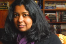
Julie Dillon is a freelance illustrator from Northern California. She has won the Chelsea Award, and was nominated for the 2013 Hugo.
Apex Magazine: Can you tell us a little bit about yourself as an illustrator?
Julie Dillon: I just really enjoying creating in general; I used to also write stories and play music and do different crafts, but illustration ended up being the creative outlet that I focused on for my career. I feel like illustration gives me the flexibility to tackle more abstract or loose ideas, as well as just enjoy the process of putting time into developing a skill. I get really excited by interesting composition and color and storytelling possibilities, and I’m very grateful that I’m getting to a point that I have enough experience to execute the ideas I come up with.
AM: ‘Ariadne’ is a very haunting piece, which follows the line of sight from the looming Minotaur to Ariadne herself in the maze. Can you describe what your inspiration was behind this piece of work? Was it in any way a challenging piece to create?
JD: A while back I was asked to do some mythology sketches, and one of the ideas I came up with was a sketch with Ariadne searching for the Minotaur in the labyrinth. Unfortunately the concept was rejected by the client and we went in another direction. I really liked the idea, though, so I kept it on the back–burner for a while. Months later, I was musing on the idea again, and it occurred to me how interesting it might be to have the Minotaur looming huge beyond the horizon line, dwarfing the labyrinth instead of being dwarfed by the labyrinth. When I started sketching it out, I started thinking about curving the horizon. It doesn’t necessarily make a lot of narrative sense, but I really like the visual.
The perspective was definitely a challenge, but what helped was finding the right perspective grid to work from. I did a Google search for pictures of wireframe spheres and fish–eye perspective grids, and used those to help give me a reference for how to structure the labyrinth while still making it look like it was a spherical surface.
AM: Your website gallery features a healthy blend of bright, stunning colours in all of your paintings. Do you have any favourite palettes? What attracts you to utilizing vivid painting techniques and colors in your pieces?
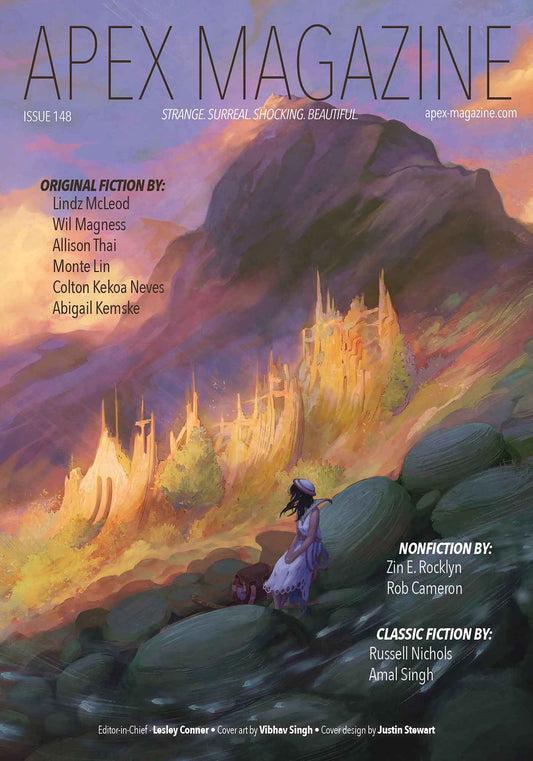
JD: I was noticing when going through my gallery a little while ago that I seem to lean towards a lot of gold, blue, and purple in particular. I like those brighter color schemes because they are so lively and energetic and eye catching. Sometimes I try to make an effort to dial back the color, but in the end I always making it more vivid. I’m drawn to art and design with bold complementary color schemes, and I try to recreate that in my own work because it’s just something I find more exciting and evocative.
AM: I noticed on your blog that you have a fascinating step–by–step screen shots of your work, from thumbnails to completed piece. I think artists and art–lovers alike really enjoy seeing an artist’s process. How did you come upon this process? Is there a lot of trial and error, or do you have it down to a set system?
JD: It was definitely trial and error, plus combining ideas and tips from other artists over time. Years ago, I used paint straight with color without doing a sketch or greyscale composition. However, when I started doing more freelance work, it became necessary to send black and white sketches to my clients for them to approve before I began the color stage. I didn’t like working with line art, so I had to figure out how to add color to my messy greyscale paintings, and I found that using color blending modes in Photoshop (Overlay layers, Multiply layers, Hard light layers, etc) gave me a good way to do just that. It turns out it’s similar to how some oil painters work; you create a sketch, and then tint it with an quick wash to create an underpainting before beginning the main work of the painting.
AM: What interests you about illustrating and drawing art for the science fiction, fantasy and horror genres? Do you have a preference for any particular genre? What do you love drawing the most in these genres?
JD: I’m probably more drawn to fantasy and magic realism. I’ve always liked those genres in general, and I like being able to create work that resonates with me and lets me stretch my imagination a bit more than if I was doing more scholarly studies. I like taking something that could be a more straightforward fine art subject and twisting it just enough to give it a more magical unreality. Fantasy, scifi and magic realism help stir people’s imaginations, and helps them try to see beyond or appreciate what is often dismissed as mundane.
AM: Congratulations on the Hugo Award Nomination! How do you feel about being the only woman nominated for this category in over 20 years?
JD: On the one hand, it’s a huge honor to be nominated, and I am incredibly grateful. But it’s also unfortunate that there haven’t been other women nominated in such a long time, especially when there are some very talented women in the field who I feel should have been honored before me. Hopefully we’ll start seeing even more women being recognized and earning more rewards in the arts in the coming years.
AM: Thanks again, Julie. We look forward to seeing you acquire further awards for your work!
