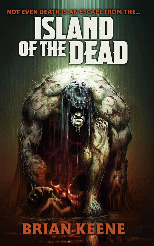
This month’s cover artist is Vincent Sammy, an artist combining his preferred medium of watercolor with digital tools to create fantastic visions of horror, science fiction, and fantasy. We recently spoke with Sammy, who is preparing for the zombie apocalypse at his home in Cape Town, South Africa.
APEX MAGAZINE: Your beautiful piece “Depth Charge,” this month’s Apex Magazine cover, gives the viewer intrigue without spelling out the entire story. How do you balance capturing the viewer’s interest in a piece without overloading them with information? How much of that balance is planned ahead of time, versus on the fly during creation?
Vincent Sammy: A lot of the layout is planned at the beginning stage through rough pencil sketches. Some changes may occur afterward when, during the color stages, certain things that you had not thought of before come to light. However, those are usually minor changes. “Depth Charge” originally appeared on the cover of Something Wicked magazine. It was the only magazine in South Africa devoted to horror and sci-fi, and is where I basically got to hone my craft in these genres.
I find that, for me, the best way to create intrigue is to have elements that are not often associated with each other, yet fall within the realm of possibility. Then add aspects such as the tube connections coming from the fingers that lead off the page. It raises questions such as where does this lead to and what is its purpose? Then I added the bandages to the eyes that gives it a sense of something having happened beforehand. Now you have an image that is improbable, but not impossible. An image that is rooted in past, present, and future. And if all of these elements work together well, you have an illustration that tells a story by itself.
AM: Many of the works in your DeviantArt galleries are illustrations for publication, and you listed on your profile that you are a graphic designer. How does graphic design come into play when you are working on an illustration? Does that sense change at all when it’s a personal piece, and doesn’t require the considerations that publications have?
VS: I’m not sure whether this actually helps me or perhaps holds me back, but I do know that I always consider the image from a design point of view. Will it work well within the dimensions of a cover and its typography, or how do I need to lay it out in order to assist the magazine designer’s creative approach if it’s an interior piece. When it comes to personal work I try not to think of any design aspect but rather to let the piece go where it wants. If at any stage it needs to have design elements added, I will let the image dictate the final outcome. In general, most of the illustrations that are personal pieces end up with design elements. Especially when I work on my personal magazine/comic project called Echo Gear.
AM: Works such as “Going to the Sun Mountain,” seem more subtle in that they infer that something horror related just happened, or is about to happen. How do you approach representing horror without falling into gore and other shocks? How should an image represent horror, or even science fiction or fantasy, without falling into obvious tricks or shocks?

Going to the Sun Mountain
VS: Horror is probably one of the more difficult genres of art to get right when it comes to creating a static image. When you do horror in movies or television you have the added help of sound and movement to assist in building tension. You can also force your audience to see what you need them to see when you need them to see it. With illustration you don’t have that luxury. Your image is immediate and it’s just there. No build up, no jump-scare, and no foreboding. So my approach to horror art is one where I try to show as little horror as possible. To a horror audience, a gore-soaked monster is about as scary as a Smurf with a lollipop.
So there are two ways in which I approach the genre. One way, which is the method I employ the most, is to portray the beauty in the story or the idea that I have. If you look deep enough you will find it. I find modern fashion photography a rather big inspiration in my approach to horror. The static image that dares you to either love or hate what you see. I find that by portraying something bad or evil in a manner that is beautiful, you can lure the viewer into a false sense of security as to what they are about to read. Then juxtapose the main image with other elements that can create unease with the ability to disturb and provoke a question such as “Why do I like this image when there is something off about it?” That is the main approach to “Going to the Sun Mountain.” Although this story contains supernatural violence, I preferred to keep that aspect out of the image. I focused on the close bond of the girls with the element of the tire iron looming off to the side with debris in the background.
My second approach is one where I like to invent new monsters. Beware the Dark’s cover was one such image. In this day and age where vampires sparkle, Frankenstein’s monster is a superhero, and werewolves are teen crushes, I feel the need to bring fear back into the fold of horror. The Beware the Dark cover was one of creating a new monster, “The Witch-angel of Maggots”, who seduces and kills the fathers of happy children. Too many monsters have lost their teeth over the last few decades. Someone needs to look out for them. :)

The Witch-angel of Maggots
AM: Your galleries feature a variance of digital, traditional, and mixed media. When you are working on a project, do you tend to stick with a certain media as you go, or do you allow the piece to move you towards mixing techniques together?
VS: I generally stick to the method of using traditional media such as watercolor paints or pencils. I like the idea of having a one of a kind original image as to a totally digital image. This image then gets scanned and manipulated in Photoshop, a sort of post-production process that allows me to add mood and color correction or even introduce or delete elements where necessary.
AM: When you are working on an illustration for a story, such as Bryan Smith’s Deathbringer, how do you approach bringing an author’s vision to life? Is there a point, going from the author’s words to your visuals, that the interpretation becomes more of your vision than the author’s?

Deathbringer
VS: I always read everything that I illustrate. I hate creating an image from spec based upon the publisher or author’s notes about what the characters look like and what they do. I find this leads to images that are not engaging, as you have no true sense of how to portray the character’s intent or predicament. Luckily I don’t get a lot of those kinds of requests. I read Deathbringer and made notes about everything as I went along. Sometimes things crop up in a story that’s not fully explained and I’ll do research on it. I like the details of an image to be accurate. I found the character portrayed on the cover to be the most intriguing and decided to use her with another character in the background. The cover gives the impression that she is the hero of the story and is some kind of ass kicking zombie killer, but that’s not the case. She is in fact a duplicitous and conniving person who, just like the main characters that she deceives in the book, now has the job of also deceiving the readers into thinking that this is the kind of character that they can root for. In this way I think I presented the cover in the way that the author wrote the story without giving away any of its content.
There are some instances where an author would request a specific kind of image and if I feel that it may be a bit off center I will present them with alternatives to what I think may be more effective. But I have been lucky in working with a lot of publishers and authors who have complete trust in my vision and with whom I can have an open dialogue as to what best fits the cover. There are times where I too miss something obvious, and therefore this kind of relationship is what always makes for creating the best product possible.