This month’s Apex Magazine cover artist is Mélanie Delon, whose award-winning fantasy paintings have been featured in many publications worldwide. Delon’s work has been selected for the prestigious Spectrum annual, and she is a regular contributor to Imagine FX magazine.
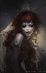
APEX MAGAZINE: Many of your works feature women with very smooth skin, a perfection of beauty. When you create a piece like “Promised,” how do you approach the challenge of using only the texture to indicate horror? How do you feel the subtlety works over a more overt horror?
MELANIE DELON: I love playing with contrasts, whether it is light, colors, or the theme in this particular example. I made this illustration for Halloween; I wanted to revisit the classical theme of the bride, with subtlety, while avoiding gore. The choice I have made to draw just part of the face as if the character was undead became rapidly obvious to me. I chose to balance and counterbalance the dark side with soft colors and dimmed lighting. The face texture brings a twist to the drawing and dynamism to this composition. I deliberately chose not to use blood which would have been too simple and evident, but rather work a more subtle decomposition that is not obvious but raises interest and questions the viewer.
“Promised”
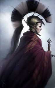
AM: With your cover piece for this month, “Red Poison,” there’s a mix of the portrait of a beautiful warrior ready for battle, with the fantasy and battle elements around her. Where in the process of creating a piece do you decide if something should be pretty, or textured, or even strict versus loose painting techniques? Do you work with a solid plan, or many changes as you proceed?
MD: I generally start with a basic idea, whether for a sketch or an image, but the concept always evolves with time. Usually, parts that have been worked and textured with more attention are the main pieces of my composition, those that more particularly address the eye and the interest of the viewer. In the case of “Red Poison,” the armor is the key element of the character, placed in the spotlight much more than the rest of the costume. I voluntarily leave the rest of the illustration much less detailed, even blurred at times. It is as much an artistic as a technical choice, those extremely detailed areas are very time consuming, and the blurred parts allow saving precious time.
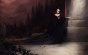
AM: Some of your works escape the idea of portraiture, indicating a backstory of something that is either about to happen or just did happen. The idea reminds me of Edward Hopper’s work, and a piece like “Impera” gives that exact sense that the viewer doesn’t know the whole story. Do you start with a story in mind, even with your portrait works? At what point do you decide that the viewer shouldn’t know something, and have you ever removed that from a piece as you are working?
MD: I always start an illustration with a preconceived idea of the story, the starting point remains my will to draw a composition, a choice of colors or a feeling I wish to pass along. The story often unfolds by itself, the ideas emerged one after another as the drawing develops. Adding details such as the outlined sculpture on the column is a primary step for me. I love to disperse clues all around the character and the illustration in order to let the viewer imagine his own story, but also discover new details with each new look. I have never felt compelled to erase this type of detail, nor hide anything from the viewer; what is important for me is to give much information regarding the story, but without imposing my view, and instead guide the imagination of the viewer.
“Impera”
AM: Digital artists are often belittled with the idea that they aren’t “real artists,” that the computer does all the work. Being a digital artist myself, I know how much really goes into a piece, and how much talent and hard work it takes. Which of your pieces would you point out to a critic to debunk that idea? Is it worth the time to do so, to try and change someone’s mind?
MD: Changing mentalities takes time and energy, but I believe this evolution will happen over time.
I would rather choose to show the whole creative process of a piece, from the very first paper sketch, then the coloring, the construction of the composition, to end with additional details. Even though an illustration requires two to three weeks of work, it’s the final result that matters the most, along with the choice of the character and the idea, no matter how much time has been spent.
Luckily, whatever the media (concept arts for films, video games, etc.), the choice does not rest on the tool but on the result, and working with Photoshop proves highly beneficial for the client.
AM: In talking about Patreon and Kickstarter with another artist, part of what we discussed was the amount of time and work it takes to keep those going. Creating videos, posting works in progress, and even blogging about their pieces seemed to take more time than their actual art. How well have your Patreon efforts succeeded, and how do you balance your art creation time with promotions? Does the pull of promotion ever impact your work or creativity?
“Made of Stone”
MD: I admit my weaknesses when it comes to promotion and social networks, it’s a real job and I can’t really find the time. I envy artists who manage both creation and communication, as this has become a necessity for a freelance career. I have not managed the perfect balance; I would need 48 hour days to honor my contracts while posting content information on social networks!
Patreon is a very efficient tool providing it is regularly fed. For now, I am trying to propose a tutorial per month, which proves rather difficult when I have a few projects to hand back, but I hope to be able to offer rewards in the months to come!
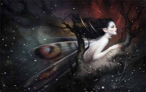
“Snowfall”
AM: For me, creating a posterbook or calendar is like picking the best pieces for a portfolio, which itself sometimes makes me feel like I am trying to decide which of my children I love more. When you are creating your calendars and collections, what are things you are considering with your pieces? Are there outside influences, such as fan requests, or the popularity of a piece?
MD: It is effectively a very difficult choice! I always try to propose a mix, and since my preferred illustrations may not be the most popular, I do my best to satisfy everyone. I will for example choose a few recent pieces mixed with older ones to produce a calendar. I also mix themes to please my followers, as some prefer darker subjects, while others like more joyful ones. I also make it a rule to include an unpublished drawing (most often the cover) with each new product, as novelty generally triggers impulse buying!
AM: Thank you for answering my questions, Mélanie.
Want to see more of Mélanie Delon’s beautiful artwork? Head on over to her website at www.melaniedelon.com.
