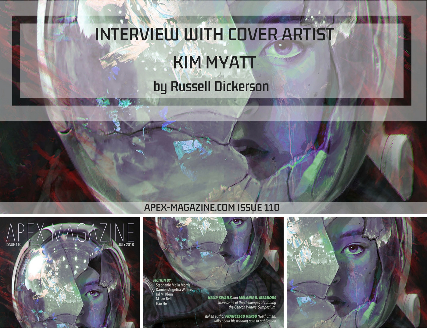
Self-taught artist Kim Myatt’s haunting piece “Pathfinder” graces the cover of this month’s issue, with its melancholic look at science fiction. Through sketching, subdued color palettes, and unique, often somber settings, they bring an extraordinary vision of horror and sci-fi to life.
APEX MAGAZINE: On your website’s About page, you mention you are “inspired by dark romanticism, ghost stories, liminal spaces and abandoned buildings,” which seems to fit this month’s cover piece. Do you find that any one of those ideas takes over a particular piece as you are painting, or do they meld together into a common thread as you work?
KIM MYATT: My influences are so vast that I should think they all culminate when I paint something—there’s always a general feeling of darkness and ominous presences, even when I’m trying to lighten things up. It just permeates. Some of my influences are quite disparate, however, such as dark romanticism and sleek sci-fi, so sometimes one feels stronger than the other when I work, usually depending on my mood or the media I’ve been consuming in the time around making something.
AM: As an artist myself, something you said on Instagram in April rings true for my own sketches: “I think my sketches are much more expressive of myself.” What does sketching offer from a personal standpoint that painting a fully-finished piece might not? Do you sketch specific ideas, or let the ideas flow however they may?
KM: I do a bit of both. I find sketching to be a wonderful place to explore and allow yourself to mess around with ideas and floaty bits of inspiration that have no clear anchor point yet. Maybe that’s why I feel they represent me more. There’s an intense pressure, with finished pieces, to have something fully realized and perfectly finished, and sometimes ideas just don’t come that way. I think there’s an overall clearer picture of me through my sketches because of it being an environment that allows amorphous concepts to generate and then either die on the vine, exist as themselves, or develop into something larger.
AM: Many of your pieces, such as “They Blink and Reality Shivers,” feature a subdued color palette. Do you find that you are attracted to pieces from other artists, or even photographers, that have similar palettes?

KM: Yes, for the most part. I love greys and blues because I find they quiet my extremely busy mind. I feel a calmness within me when I look at palettes like this. Conversely, some of the other palettes I enjoy have fantastically bright colours, but only in small bursts or one very dominant colour. I’ve never liked paintings or imagery with many assorted colours and never understood why, as an artist, one was always pushed to develop in that direction. Colour is so powerful, to me, and I like it when it’s used sparingly and with interesting precision.
AM: Your painting “Nokken” and the description for it show that horror is here, waiting for the viewer, but you leave it up to the viewer to decide for themselves what will actually happen. Is it easier or more difficult to find an audience willing to take those next steps without something more overt happening? What emotions or curiosities are you hoping to invoke in those who find your work?
KM: I think it might be easier in some ways, but harder in others. Easier because everyone has fears and if you show the build-up to horror, but not the pay-off, it’s easier for the viewer to impose their own, very personal fears onto the painting, and therefore, it is always the most effective for that viewer. I couldn’t guess at what they’d find scary, so the less I show, the better. On the other hand, some people can be lazy and don’t want to, or don’t have the capacity to, visualize what happens next, so for them, if I showed the creature emerging from the water with teeth and claws, that would be more satisfying for them because there’s no work involved and no engagement needed.

There’s a whole lot of horror-theory I could go into here, regarding what works and what doesn’t work in horror and what successful horror is, but I think I’d need a lot more room for that. For me, though, what satisfies is laying the groundwork for horror to happen and letting the personal fears and experiences of the viewer fill in the blanks. There’s a delicious sort of give-and-take relationship there that I find most pleasing. I’m giving the viewer a chance to experience, to look at, and touch their fear, rather than imposing my own with a hammer upon them.
AM: You have a few connected images in your portfolio based on the Netflix series Dark, including “Wann ist Jonas.” Does the art fill a gap for you, in the series, some sort of visual that you wanted to expand on? What do fan art and personal work mean to you, as an artist, and your own interpretation of media?

KM: For me, when I draw fan art, it’s because I’m wanting to hold onto something that touched me on a personal level after the media that showed it has run dry. I want to play in that world a little more, explore it on my own terms, and put down in paint my emotions and thoughts that I couldn’t otherwise accurately express with words. Like the media itself, too, the fan art is also a form of escapism. As an artist, you’re always in your own world, which is full of your own fears and desires, etc. To step into another person’s vision, to enjoy time trying that on for a while, gives the brain and the heart a little bit of a rest and I think it’s healthy.
AM: A hearty thank you to Kim Myatt for an insightful look at their works of art. More of their art can be seen on their website at www.ysvyri.com. On their Patreon, they offer both artwork and a look behind the scenes at their creations.