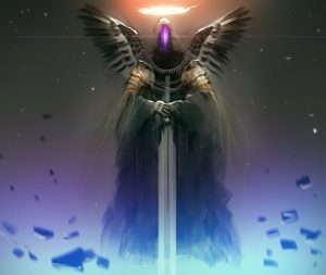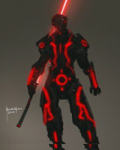
This month’s cover artist is Benedick Bana, a freelance concept artist and art instructor from the Philippines. His work has been featured in a number of publications worldwide, including ImagineFX, Advanced Photoshop, and Clarkesworld.
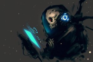
APEX MAGAZINE: In your cover piece for this month’s issue, there is a great sense of movement and action with both the character and the simpler environment. Does that simpler backdrop affect how a viewer might explore the story within it, compared to a more detailed environment? Say, if the environment was an elaborate cityscape, would that alter the viewer’s sense of the story happening around the character?
BENEDICK BANA: A simpler backdrop has always been my choice. It allows the viewers to focus on the character. An elaborate backdrop may accentuate the art, yes, but in my experience most of my viewers would be more interested in the subject. They would usually ask me about how I create them, the brushes I use and the colors I pick, etc. But of course, in cases where I am required to do concept art that has a detailed backdrop, or if I think it more appropriate such as when I think the character will be best described with its environment, I ensure that the character is in sync with its background. For instance, if I design a character that is dynamic, the background must allow him to be so.
AM: Your piece “Mecha design 002” is a great look at the sketch methodology of creating a mechanical design. As those sketches evolve, how do you determine which ideas stay and which don’t? Or does that depend on the individual creation as it develops?
BB: I usually base the evolution process on its original design, combined with using some references. For instance, in deciding whether or not the weapon or armor upgrade is suitable for the character, I would first study the character that I would create. I would consider a number of things, especially those things I might not know about it. But more than this, I usually get ideas from my head in the process of sketching.
AM: In your DeviantArt gallery, you have a piece titled “Using Ref Image for Color Scheme” that shows a reference photo and a color palette. As a long-time designer, it reminded me of the common practice of setting up a consistent palette, often for branding, before starting a project. Do you use this technique on most of your creations, even informally, or only on certain ones? How does that pre-production work pay off later in the process?
BB: I use this technique mostly in teaching and in commissioned projects. But most of the time I explore different techniques in coloring. It could be, for example, starting with shades of gray, then applying the colors later, exploring the default palettes of a painting app. I would also consider using a reference image a great help for coloring because I can get the right tone for the design. For instance, in creating an environment, references would help me easily identify what color scheme for daytime or nighttime, or sunrise and sunset, would be most appropriate.
Setting up a consistent palette and using references as a way of pre-production will not only reap the benefits of planning, but it allows you to use them as palettes and references for your future designs.
AM: A few of your pieces delve more into horror, such as “creature design 001.” Does the more organic nature of a monster change how you create your pieces, or do all of your ideas fall under a type of shared world idea?
BB: In creating monster designs with an organic nature, I simply use the same process as when I create a mech. I usually develop the character in the process of sketching, but still taking into consideration some things I have initially studied about it and the brushes and colors I see fit to it.
AM: You have a number of fanart pieces featuring redesigned “mech” versions of comic and movie characters. When creating something like “Fanart Thor,” how do you combine the ideas and still keep them recognizable? Is it a combination of stance, outfit, or a number of things?
BB: In designing fanart pieces, I think it is most important to look for the prominent and distinct parts of the character, so that even as I apply my style to it the character will still be recognizable. Usually, the character’s outfit and details, color scheme, and the character’s ability and skills make it identifiable to the viewers. So, modifying them is a combination of all of these and my own style.
AM: Thanks to Benedick Bana for a great look at how he develops his art. Find more of his artwork on his ArtStation profile at https://www.artstation.com/benedickbana.
