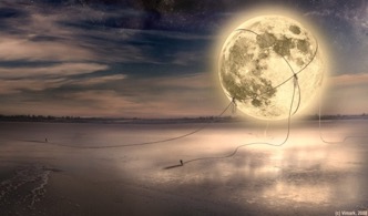
This month’s cover artist is Max Mitenkov, a digital artist in Belarus. With an eye for combining post-apocalyptic environments with more personal figures, Mitenkov creates fascinating worlds at odds with themselves.
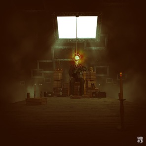
APEX MAGAZINE: “All Is Vanity” highlights a nearly lifeless world, with the crow appearing to be the only living thing. Was that idea of life versus lifelessness your original intent? Have others interpreted the image to mean something other than what you intended?
MAX MITENKOV: I like different interpretations of this art, maybe each person finds something different. My interpretation focused on the relationship of man to the world and what happens in it. Very often, a man ceases to care what is happening around him. He is closed in himself (wears a suit). Everything just falls apart. A person is alone, unable to change anything. He says to himself, “All is vanity.” Gradually, he loses control over what is happening. He remains alone. The raven is what remains from his relationship with the world.
AM: Adobe Photoshop, and other digital tools, allows for a nearly limitless expansion of ideas in any direction. When you are working on a piece, is it difficult not to keep tinkering with effects, changes, and techniques?
MM: When I think of the idea, more often I can already see how it will look. So, when it comes to the idea to implement, I know what I need for this project. I can say that I’m not working too long on changes, trying to achieve what I saw in my imagination.
AM: As a long-time digital artist myself, I find much of the challenge in photo manipulation is making sure that the photos and textures I use match up well. Not leaving odd lines from layered photos, making sure that cast shadows make sense, that sort of thing. When you are looking at works from other digital artists, are there things like this that might take you out of the emotion or intent of the image? How much time do you spend on your own pieces looking for any errors?
MM: In good photo manipulation, there are a lot of important factors: perspective, shadows, texture. Composition is very important. Of course, when these factors are disturbed, it makes a huge difference on perception. When I look at the work of other artists, I appreciate the general perception, but more important to me is the idea. A good idea is thought-provoking, for me the question arises: How would I do it?
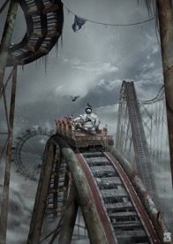
AM: Many of your pieces come from online art challenges, such as “Survivor,” based on the “Stockpocalypse Challenge.” What have you learned from challenges and contests like this, and how important are they to your methods?
MM: I sometimes participate in online contests. They allow me to focus on the idea of the contest, giving me the opportunity to show my point of view on the topic of the contest. Furthermore, considering the art of the other participants, to evaluate yourself, and learn. Contests are very useful. You participate in a general discussion, follow art directions, and get acquainted with the bright new artists and their artworks.
AM: Many of the landscapes featured in your works are muted in tone, often gray and seemingly post-apocalyptic. Do you approach the emotion and ideas behind brighter pieces, such as “Blue horizon,” in a different way? Does the brighter palette change the mood of what you might have originally intended for the piece?
MM: I like the theme of post-apocalyptic and steampunk. I like the gray palette. Sometimes you want to change something and there is something bright. It happened with art “Blue horizon.” If I'm not mistaken, this art came when I read the books by Sergei Lukyanenko. Such was the mood.
AM: Thank you to Max Mitenkov for the interview, and to find more of Mitenkov’s work make sure to visit his DeviantArt galleries at vimark.deviantart.com.